Adding links in the navigation menu

Links in the navigation menu work the same way how they work as regular links.

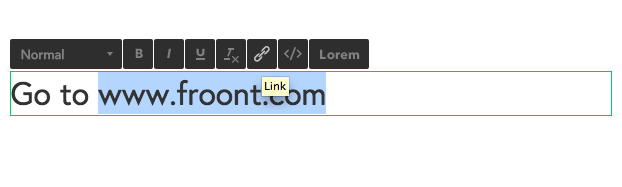
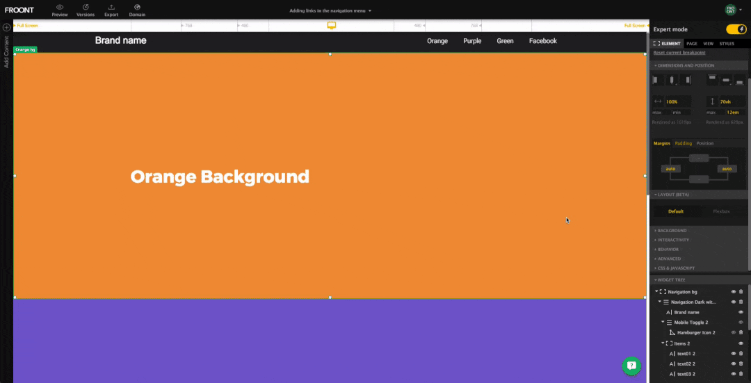
1. Click the element you want to add a link to.

2. Choose a type of the link. Two common types are an Anchor and an URL. Anchor is used when the link is in the same page, URL if it’s a different page. Learn more about text links.

Example:
If you want to add a link to your facebook.com, you need to add URL. If you’re adding an internal link in the page, the link would be #Green_bg.

adding links last
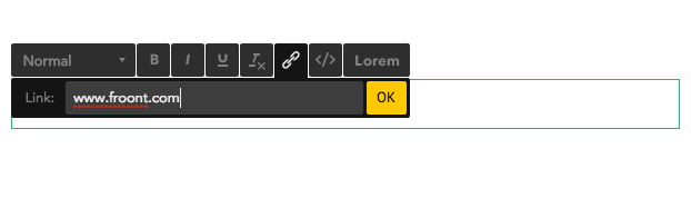
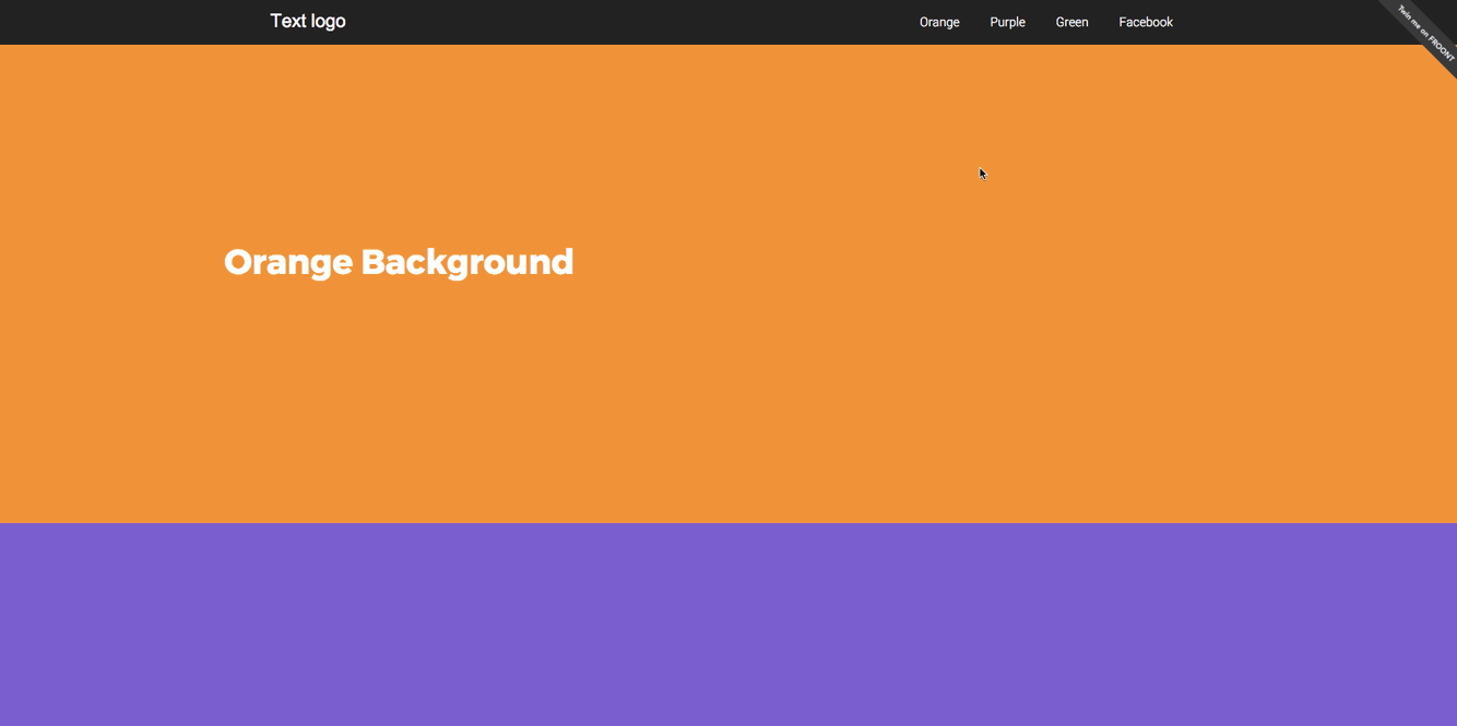
See how it looks as a final result:link-sample
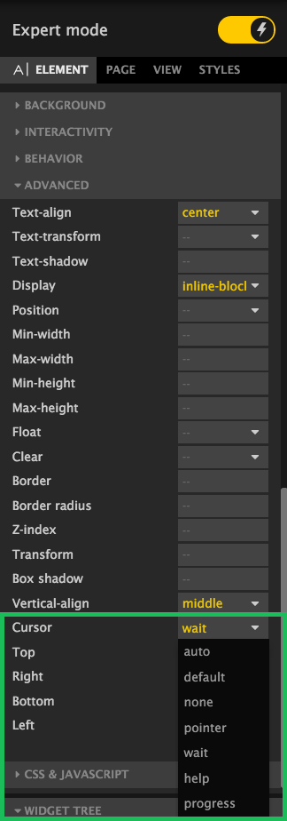
3. To customize the type of cursor is shown go to Widget Properties Panel/Advanced tab.customize the type of cursor

Here you are able to see the whole project.

Fixed background

To make your background image fixed you need to select the container and go to Properties Panel/Background and select Fixed tab.

ScrSht 2015-09-03 at 18.47.49

Animations

To add an animation you need to select a widget (text, image or container) and go to Widget Properties Panel/Behavior and choose your animation

ScrSht 2015-09-03 at 18.20.54

Text links

To add hyperlinks to an existing text:

1. Select the text you want to become a link
2. Select Link icon button

3. Type in the address and pres OK

Background fill

To fill a background color to whole project page go to Properties Panel/Page/Appearance and type in a color into the Background input field

ScrSht 2015-01-29 at 16.18.41

To Add one color background to your widget go to Widget Properties Panel/Background

ScrSht 2015-01-29 at 16.26.02

To add image as a background go to Widget Properties Panel/Background and press the Add image button:

ScrSht 2015-01-29 at 16.29.11

or double-click on the Widget.

Rounded Corners

To add rounded corners you need to select the widget and go to Properties Panel/Advanced/Border radius

If you need all four corners to be the same size then in the Border radius input field type only one value – for example 8px

This is what you get:
ScrSht 2015-01-29 at 15.51.16


In case if you need different sizes for each corner – add four values: 8px 8px 3px 3px

ScrSht 2015-01-29 at 15.53.20

Here’s the result:

ScrSht 2015-01-29 at 15.54.47


Margins and Paddings

Margin and padding are the two most commonly used properties for spacing-out elements. A margin is the space outside something, whereas padding is the space inside something.

Margins, padding and borders are all part of what’s known as the Box Model. The Box Model works like this: in the middle you have the content area (let’s say an image), surrounding that you have the padding, surrounding that you have the border and surrounding that you have the margin. It can be visually represented like this:

Padding
Here’s a real example when you need to set padding to a text widget when creating a button:

button2

Margin
Here’s a real example when you need to set margin:
margin

Border

You can find border property field in Widget panel/Advanced

border

Solid border
2px solid #000

ScrSht 2015-01-12 at 18.14.05

Dotted border
2px dotted #000
ScrSht 2015-01-12 at 18.15.44

Dashed border
5px dashed #000

ScrSht 2015-01-12 at 18.16.23

Double border
3px double #000

ScrSht 2015-01-12 at 18.16.46